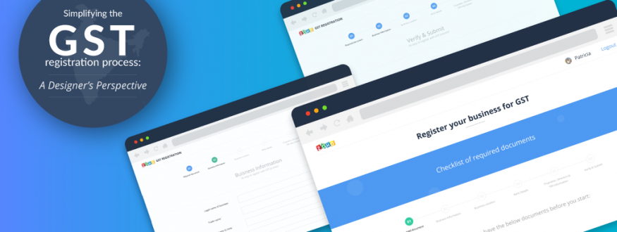
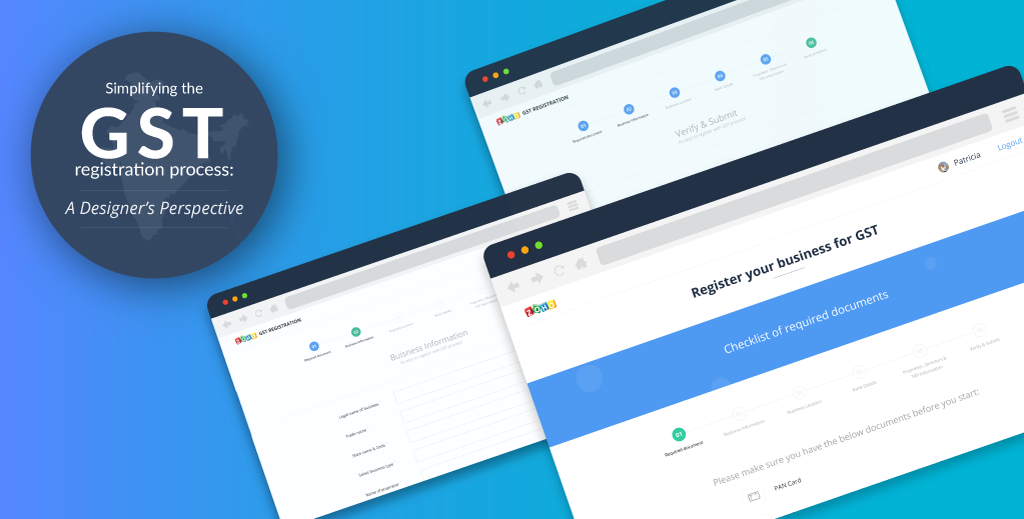
The Goods and Services Tax reform, or GST, was given the nod by both houses of the Parliament, after a 16-year talkathon came to a conclusion on August 8th. Many believe this is a major reform which, if implemented correctly, could tip the scales in favor of India’s growing economy. Following the decision, in order to put the registration and reporting processes online, the government has proposed a massive upgrade in the IT infrastructure.
In order to help businesses comply with the new GST laws, the first and most important step is to make it easy to follow those rules. The GST was proposed to make tax laws much simpler; it only makes sense that the registration process is equally easy to follow. To make a good first impression on a newer generation of business owners, who are accustomed to well-designed forms, the registration process–from the initial signup to annual renewals–needs to be an easy and hassle-free experience.
Keep in mind, however, that it’s not enough to just create an aesthetically pleasing form; what matters more is its usability. I’m of the opinion that a good form should speak to the user and hold their hand along the way. It’s Additionally, it should always be in conversation with the user–and like any meaningful conversation, there should be a logical flow of communication between the system and the user.
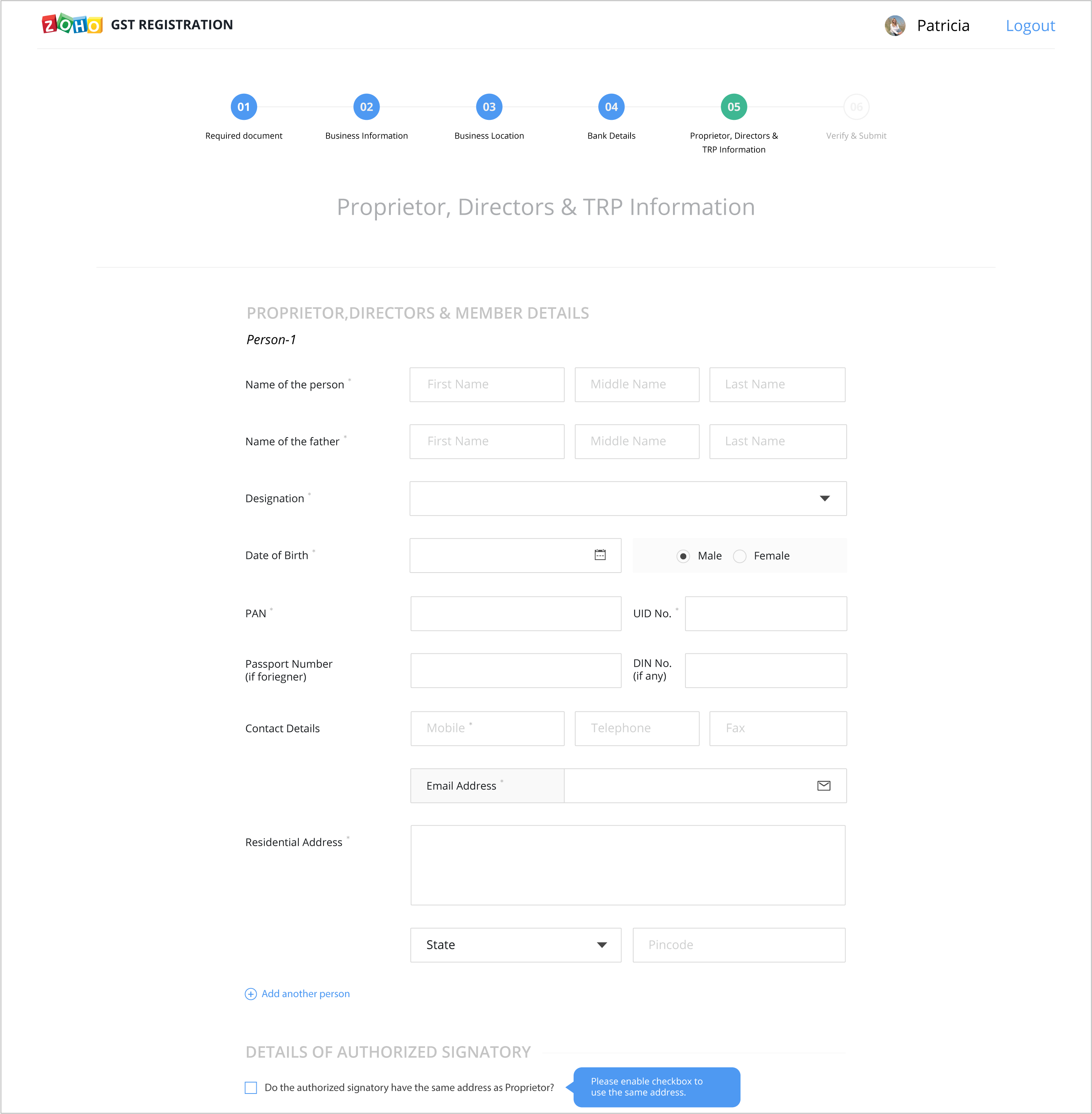
Very often, simple design changes, such as grouping related fields, providing a visual cue of what’s coming next, a progress meter, etc., can significantly improve form usability. In creating this form, we applied many of the same design techniques that we use in all of our products, including progressive disclosure, information categorization, and more.
The basics: getting the structure right.
We decided to provide a checklist of the necessary documents before app form. This will help applicants to gather their paperwork beforehand so that they have all the required information they need to fill out the form.

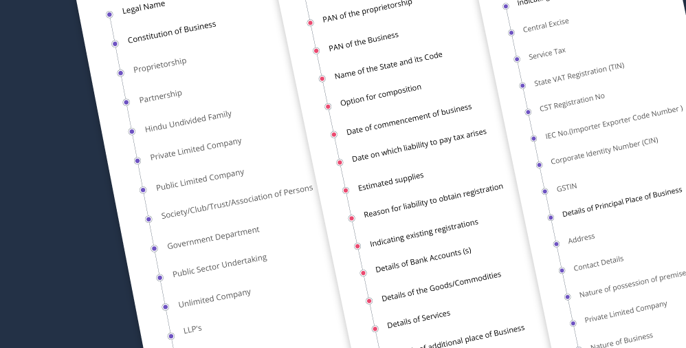
When we began working on the design for the GST registration form, we used this report to get a sense of what information would be required of applicants. Initially, the staggering amount of mandatory information took us aback. However, although all the fields are required, we realized that not all fields apply to everyone.
We began by grouping related fields together, including Business Name, PAN, and Business Type under a section called Business Details. We also segmented the whole process into six sections, so as to not overwhelm the user with a seemingly endless pile of questions. Instead of filling out one long form, each segment is treated separately and can be saved individually, allowing applicants to pause and take a breather after filling out each section.
Providing an information hierarchy.
It’s likely that not all fields in the GST form will be applicable to all users. In these cases, it’s possible to cut down the unnecessary information by asking a few questions up front. For example, a new business doesn’t need to provide information about taxes they already pay; you can cut down the tax details section in its entirety by asking if a business is just starting out. You can add more such questions to considerably reduce form size.
Reducing data entry as much as possible.
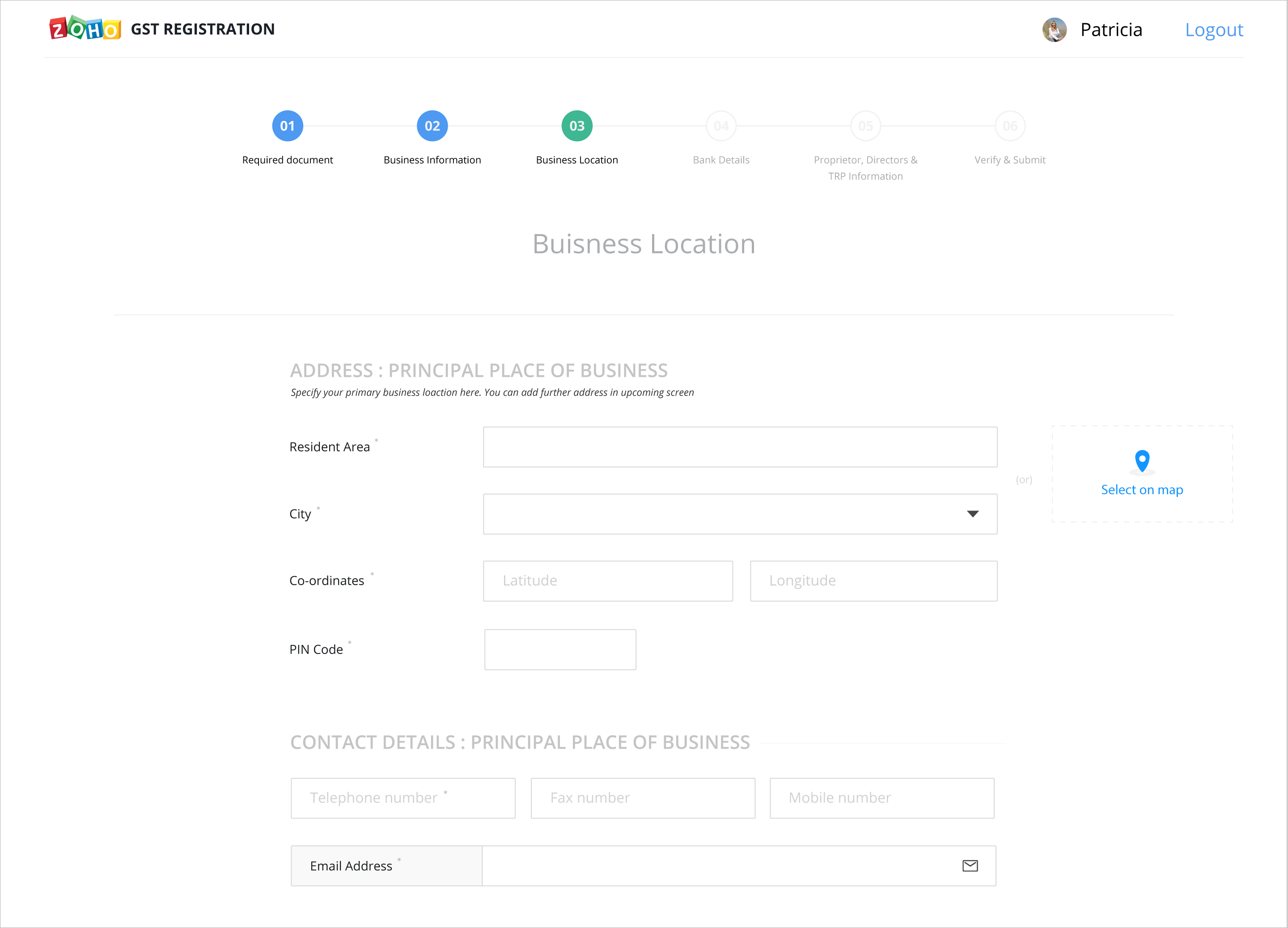
The last thing a business owner wants to do is fill out long forms. If we make use of APIs of other apps, then we can greatly minimize data entry. For example, while keying in addresses, if it’s possible to fetch location information from Google Maps, users can just select their location instead of typing in answers for seven different fields.
Additionally, in one section of the form, users are required to enter details about the proprietor, director, and authorized representative of their business. If a user is a sole proprietor, all three are the same; it makes no sense to repeat the same information three times. In such a case, a “copy to all” function will save a lot of time and effort.
Getting the right message across.
Bearing in mind that a lot of the registrants may be moving from a pen-and-paper system, the content in the GST form needs to be as clear as possible. So, That’s why, when we designed this form, we worked to remove any kind of obscurity from the content so that the form would be easy to fill out. To do this, we reformatted all labels, instructions, and error messages to make the registration process as smooth as possible.
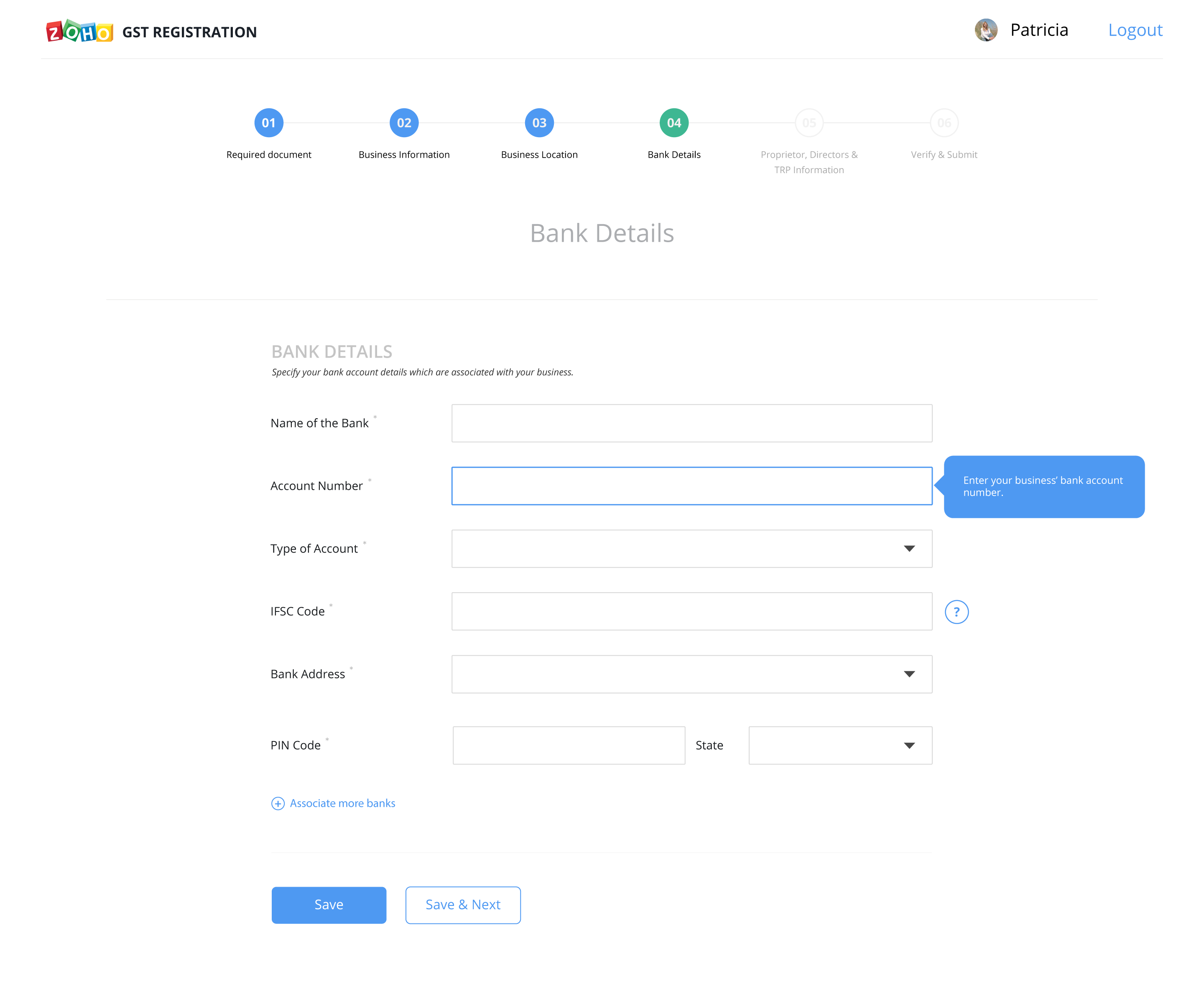
We also decided that having too much help text immediately visible on the page was not only unnecessary for more experienced users, it would also clutter the page. Our goal in designing the form page was to strike a visual balance between presenting important help tips on the page without overdoing it, and so we felt that providing Tool Tips on the page was the best way to achieve that balance. If a user requires additional information, it will be readily available to them, but it won’t overload the page.
All’s well that ends well.
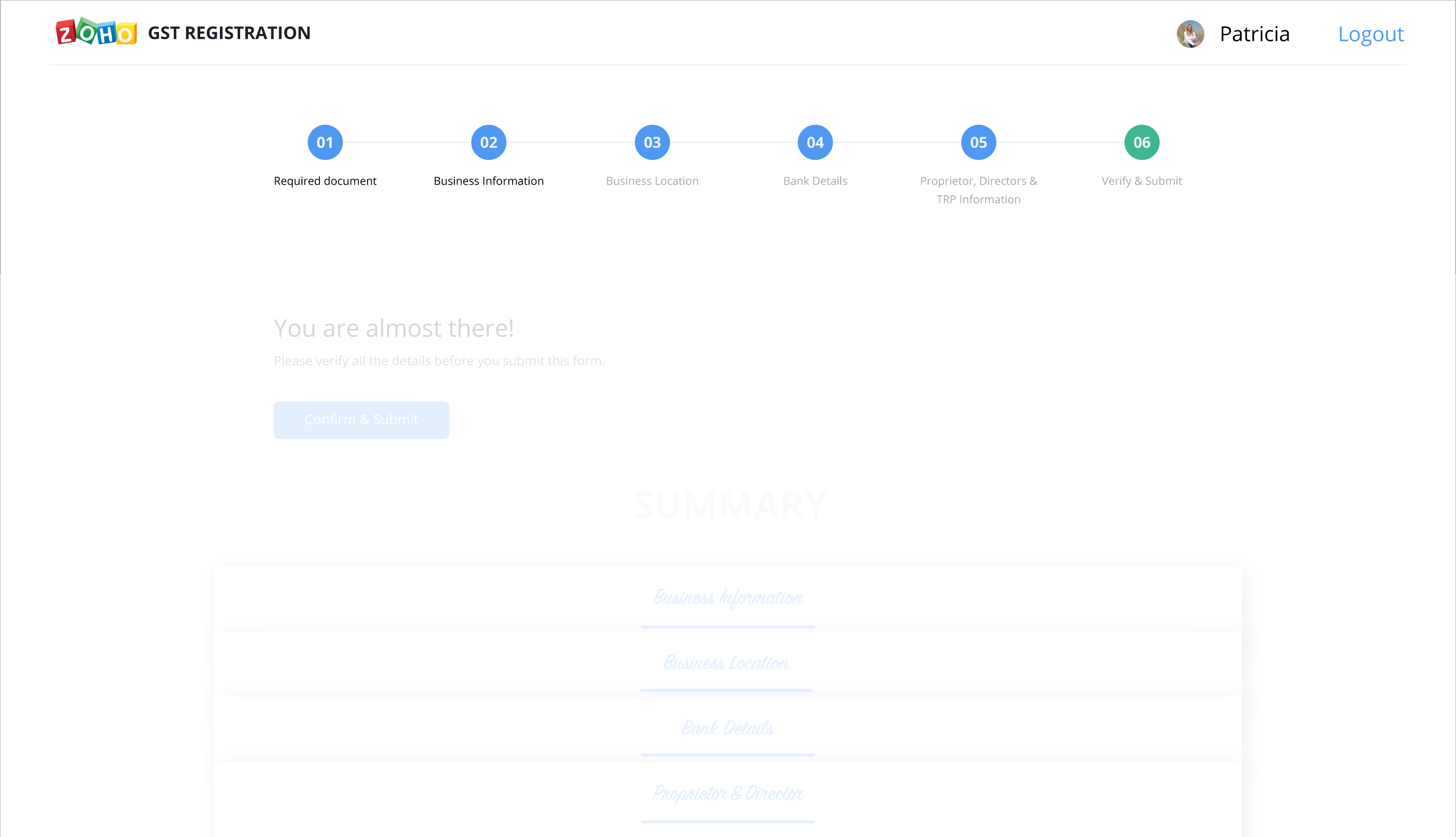
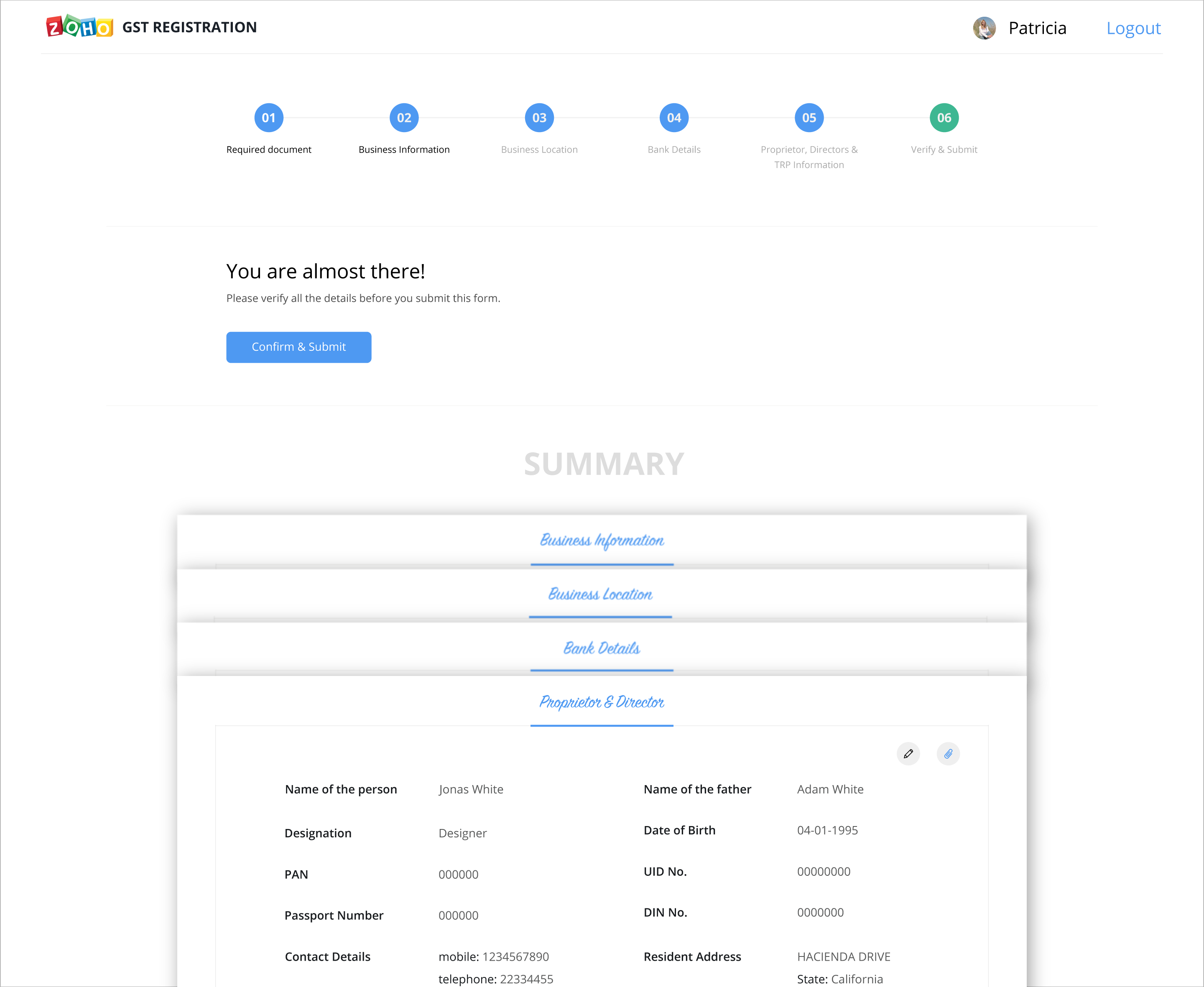
The registration process shouldn’t end as soon as applicants enter all their information. Before users submit their application, there should be one final section that displays a summarized version of all their details, so that they can easily check the form for typos and other mistakes.
Users should also be able to keep track of the status of their application, as well as receive an email notification when the registration process has been successfully completed.
It’s only natural that changes in business compliance requirements can make companies a little uneasy and frustrated; more often than not, new laws mean new paperwork for organizations to deal with and complete. The good news is that a simplified, organized registration form and a streamlined process can make it easy for new businesses to effortlessly comply with the new GST tax laws. Starting off with excellent form design can make all the difference in making the GST registration process as painless as possible.
With that said, if you have any ideas or suggestions to make this even better, let me know in the comments section. I’m all ears.
