Zoho Projects 5X is here. We have taken version 5 up a notch with a UI facelift and feature enhancements aimed at providing a smoother, quicker, and easier navigation experience. The best part of the new Zoho Projects is that, there is something in it for everyone!
For the industrious taskmasters
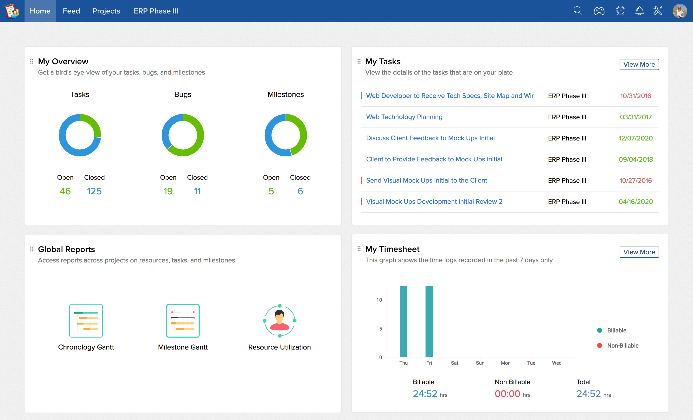
When a taskmaster or a bug squasher logs into their account, they’ve got one thing on their mind: get the job done. If you are a taskmaster or bug squasher, you will especially love the new “Home” look. This is where all your tasks, bugs, work items for the day, milestones, time logs, and events for the week are listed. Gone are the days of sifting through rows of data to discern what matters to you. Now, you can head to your Home screen and do what you do best.

For the hawk-eyed managers
The project dashboard gives you a complete overview of your project’s direction, progress, and speed. We’ve reworked our dashboard and made it a standalone tab, separating it from the project feed. Now there is more space to display useful information including your weekly digest, overdue work items, task progress, milestone status, bugs, upcoming events, team evaluations, and special mentions for top performers. Soar over your projects and take control.

For the number crunchers
Some people don’t communicate using words; they speak the language of numbers and reports. In addition to our Gantt, Resource Utilization and Planned vs Actual charts, we’ve added a bunch of Task Reports and Bug Reports. All information displayed in lists and tables are also translated to charts and graphs.You can choose to view them as a horizontal or vertical bar chart, a pie chart, or a donut chart, according to your preferences. The pleasant, contrasting color scheme can help you gauge project trends just with a glance.

For the methodical minds
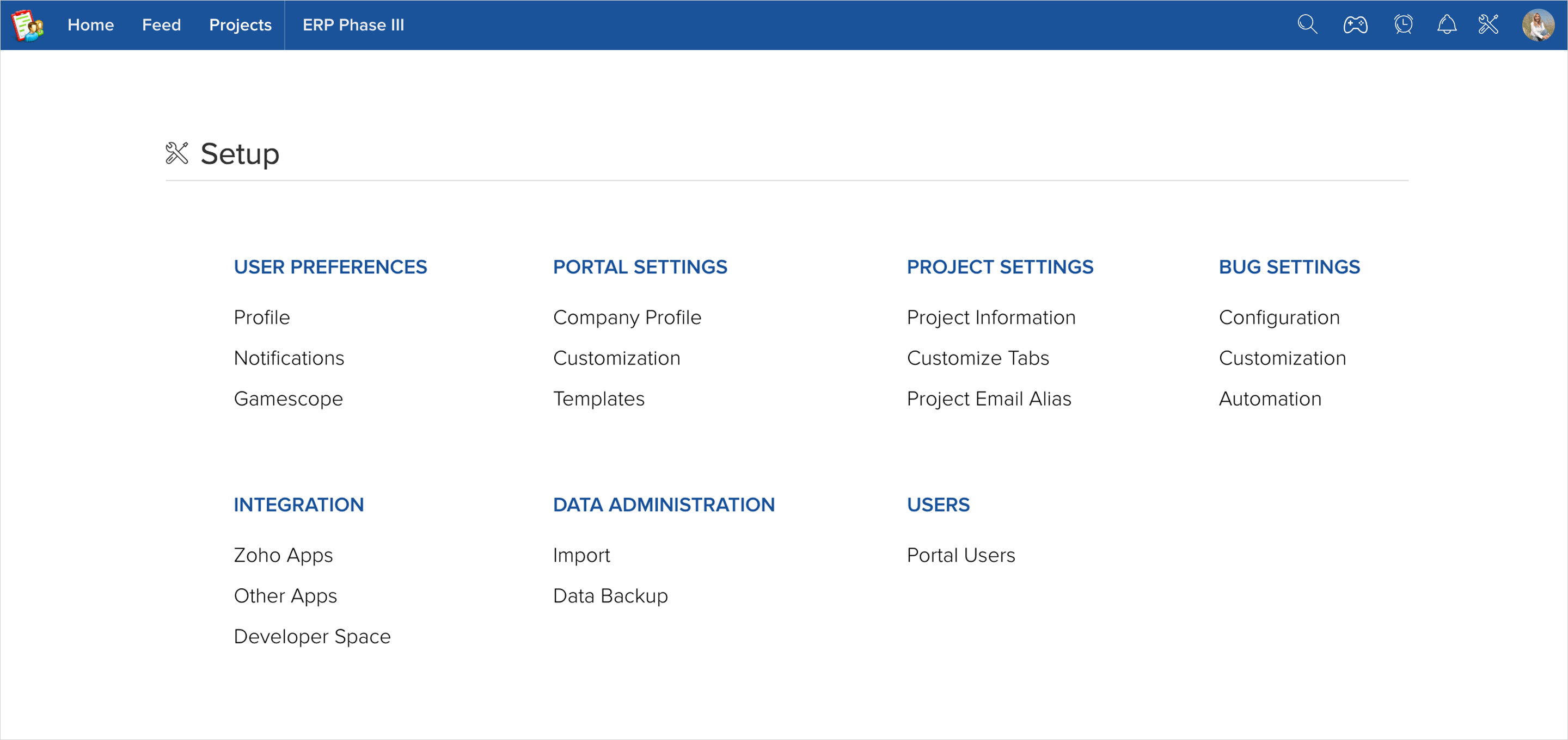
If you like to keep everything well-ordered and organized, hunting down discrete settings for each element is the last thing you want to do at work. We’re bringing you the Global Setup. This is where you will find all settings, integrations, and customizations. These are organized into categories such as User Preferences, Portal Settings, Project Settings, Bug Settings, Integration, Data Administration and Users. Easily navigate to any of these sections and get all your configuring and customizing done.

We have also made little changes here and there, all of which help contribute to a better project management experience. For instance, the app now has bigger, brighter fonts and better contrast, as well as a wider range of themes to match your aesthetic eye. You also now have the option to collapse the left navigation panel, satisfying your inner minimalist. Click on the “Try New UI” button at the top right if you haven’t checked 5X out yet. The older version will cease to exist from mid April.
If I were to summarize version 5X in a rhyme, this is how it would go:
A soaring bird’s eye view, of all that is and isn’t,
A place to call your home, all you’ve done and haven’t.
An interface that’s crafted, to be slicker than a whistle,
With less words and more visuals, and fine details neatly chiseled.
Like options now convened, all together side-by-side,
Quicker actions, smoother moves, an easy-peasy stride.
With changes big and small and a UI that’s remade,
We bring you Projects 5X- the user experience upgrade!
So, let us know what you think of the changes. Which are your most and least favorite tweaks? Which of the above categories do you fall under? Let us know in the comments below.

